Continuity Pictures 1 and assessment
What I used:
- Cleanser, toner and moisturiser
- Latex
- Kryolan primer
- Kryolan foundation palette
- Kryolan concealer palette
- Kryolan super colour palette
- Makeup brushes
- Makeup bending sponges
- Hairspray
- Coconut oil
- Dry shampoo
- Fine tooth comb and brushes
- hair dryer
- small curling tongs
For health a safety reasons I assessed Jack's skin for any contraindications and I also did a skin test on the latex product.
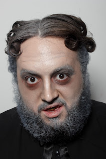
The build up to this assessment was less of a nerve racking experience this time, due to the preparation of previous assessments completed. I found that I worked well with the model as he was very good at keeping still, this helped me to achieve the look I planned for. I think I did well to produce a Dorian Gray character from a book for tv; I have tried to use techniques that I found gave the best effects, example I used latex on his eyes, this gave a wrinkled effect and after practicing the design times before the assessment I was confident in the application. I think I did well to get he right skin base, I used light and dark colours of foundation to get a more 'in depth' look to the face, I also used the dark foundation around the eyes to start off the tired and stressed look, I used super colour; blue, black and red on the eye lids and underneath the eye to add to this effect. I darkened the natural lines on the models face and pulled out some of the lines in his forehead. I then use supercolour on the beard and in the hair to make it look aged.
I parted the hair over to one side slightly to give the effect of a relaxed Victorian hairstyle, and then used coconut oil and hair spray to hold the hair down. I then curled the ends of the hair on either side into small tight curls, using curing tongs. Once the hair was styled I used dry shampoo to get the grey effect on the hair, and curled any stray hairs at the back. Overall I am pleased with the outcome of my design, but if I could do it again with improvements I would have coloured the beard less round the top of the hair line to make the colouring look realistic and faded, rather than a harsh line. I would have also painted more of his teeth with tooth enamel and added some liquorish to make his mouth black. I would have also used more latex and raging products to increase the realism of the design.


No comments:
Post a Comment